As regular readers know, I am not a pure lover of P/E ratios. I am frequently concerned that companies are passed over by investors due to some silly belief that an investment’s P/E is too high. This ratio has little usefulness when comparing companies that are in separate industries. P/E is typically a signal of the growth rate of the company, a higher growth rate should earn a higher P/E. So unless you only invest in one type of company e.g. software companies, you need to be very concerned about comparing P/E ratios between industries.
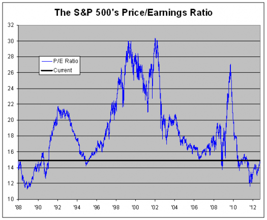
That said, I recently read a very short article on Crossing Wall Street that pointed out an interesting fact. According to the article and the chart, the P/E ratio of the S&P 500 is below the norm for 1991-2010. There are a few brief exceptions to this.
This tells us that the stock market is likely NOT at its peak. While individual companies will go down, in general the market is healthy and investors should continue to use stocks as a major portion of their portfolio.
I am re-posting the excellent stock chart comparison however I didn’t create it and it was originally found on Crossing Wall Street. I claim no rights to this image.

Great article. Inflation below the mean and low p/e sets the stage for another secular bull as inflation (interest rates) returns to normal levels. But oil is telling us to be weary of the near term. We are returning to levels that are not sustainable. Balance the near term( months) with the long term( years) and opportunity for the market returns.